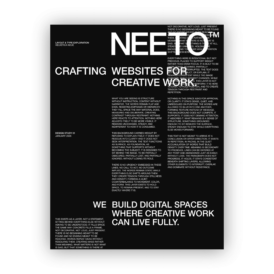
How Typography Shapes the Way People See Your Work
One of the most interesting things about web design is how much typography does before anyone reads a single word. The choice of typeface, the size of a heading, the space between lines, all of it communicates something the moment a page loads. Most visitors couldn't tell you why a site either feels coherent or careless, but typography is usually one of the main reasons.
This post is about that silent communication, and how we think about making sure it's saying the right thing.
Typeface Choice Sets the Tone
Choosing the right typeface is one of the earliest and most important decisions in any web project. It establishes the personality of a site before a visitor has processed anything else. Getting it wrong can create a disconnect that's hard to recover from, even if everything else is well executed.
A straightforward example: if the goal of your website is to communicate elegance and refinement, a casual or novelty typeface works against that immediately. The type is making a promise that the rest of the site has to live up to.
On our own site, the goal was to communicate professionalism with a quiet confidence. We chose Söhne, a sans serif with a clean, considered character that has been used across a lot of strong editorial and branding work. It doesn't demand attention, but it holds its own. That balance was exactly what we were looking for.
Size and Hierarchy Create Order
Once a typeface is chosen, how it's used matters just as much as which one it is. Size and hierarchy are what guide a visitor through a page. A clear typographic scale tells the eye where to start, where to go next, and what to pay attention to along the way.
When hierarchy is unclear, the experience turns into a hassle. Everything competes for attention and nothing wins. Visitors leave without absorbing much, often without knowing why the site felt difficult to navigate. A well-considered typographic scale removes that friction entirely. The page becomes easy to move through, and the work gets the attention it deserves.
Spacing Is as Important as the Type Itself
This is where a lot of sites quietly fall apart. Typeface and size might be well chosen, but if the spacing hasn't been given the same attention, the result still feels off.
Line height, letter spacing, and the margins around bodies of text all affect how readable and considered a site feels. Too tight and the type feels crowded and rushed. Too loose and it loses coherence. The right spacing is the kind a visitor never notices, because it's simply comfortable to read. That's the goal.
Consistency Builds Trust
A strong typographic system is more than a collection of font choices. It's a set of decisions applied consistently across every page and every element. Headings behave the same way throughout. Body text maintains the same rhythm. Captions, labels, and navigation all feel like part of the same family.
When that consistency breaks down, even slightly, visitors sense it. It reads as carelessness, even to someone who has never thought about typography in their life. Consistency is what makes a site feel intentional rather than assembled.
Typography Done Well Is Invisible
The best typographic decisions are the ones nobody notices. A visitor moves through a well-designed site and simply feels that it's easy to read, easy to trust, and easy to spend time with. They're not thinking about the typeface or the spacing. They're thinking about the work.
That's exactly what good typography is supposed to do. It gets out of the way and lets everything else speak.
Typography is one of the first things we consider on every project we take on. Not as a stylistic choice, but as a strategic one. If your site isn't feeling the way your work does, we'd love to help you out.