5 Problems With Portfolio Websites (And How We Solve Them)
Portfolio websites are often some of the most visually striking sites online. Beautiful imagery, refined typography, dramatic layouts. They can feel polished and carefully considered from the very first scroll.
This is especially true in architecture, where presentation and visual clarity matter deeply. But the same pattern shows up across agencies, studios, and creative firms. A site can look impressive while still missing key structural elements beneath the surface.
Over the years, we’ve spent a lot of time studying award-winning websites and strong portfolio work across different industries. We look at how they guide users, how they structure information, and how design decisions support the work being presented. What we’ve learned is that even visually impressive sites sometimes prioritize aesthetics over usability.
A portfolio is more than a digital gallery. It is a strategic tool. When structure, clarity, and user flow are given the same attention as visuals, the work speaks even more powerfully.
Here are five common issues we see in portfolio websites, and how we approach solving them.
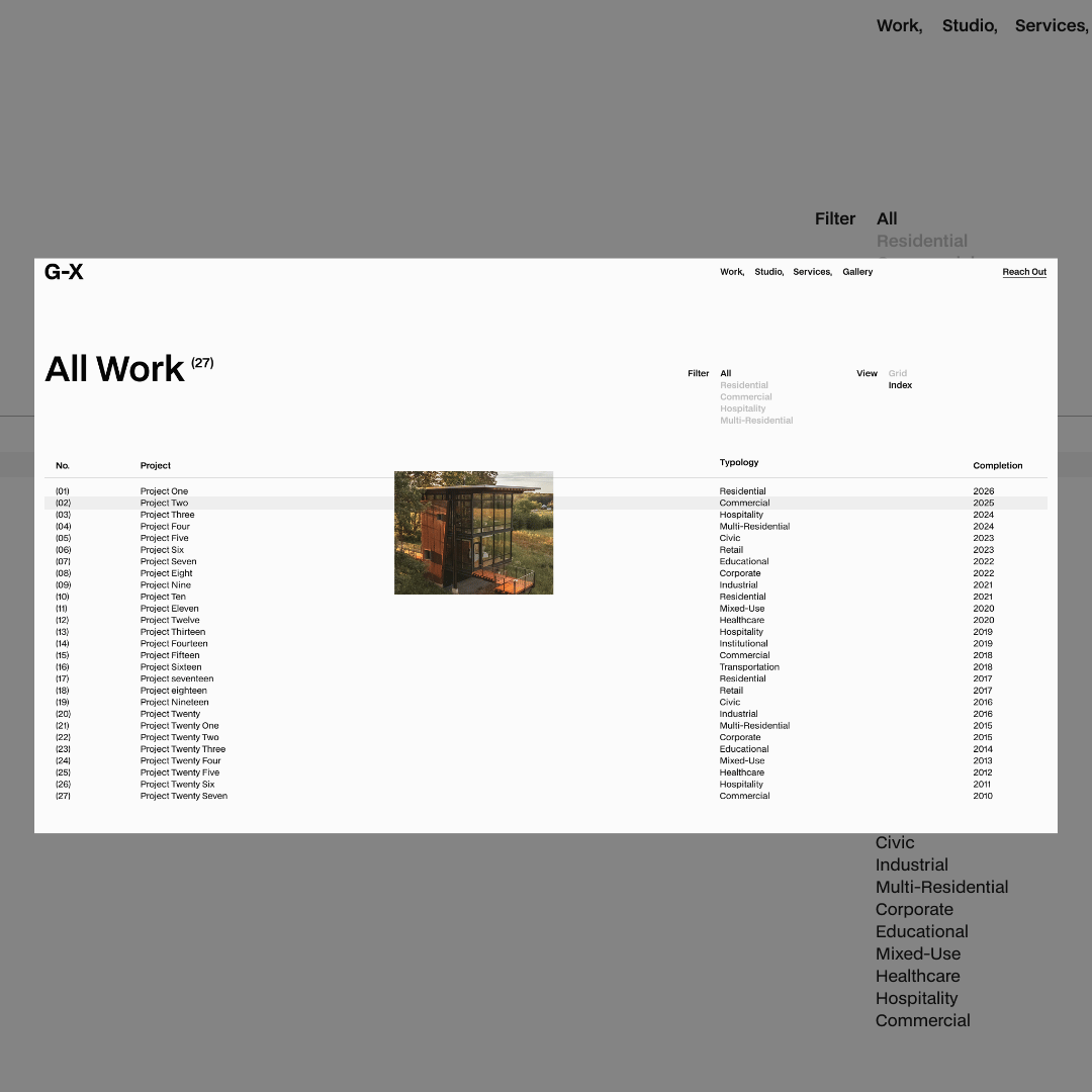
1. No Clear Filtering or Sorting System
Many firms work across multiple sectors, whether that is residential and commercial architecture, branding and digital design, or strategy and development. Yet their portfolio pages often treat every project as if it serves the same audience.
In reality, visitors are usually looking for something specific. A homeowner is not interested in large-scale commercial developments. A startup founder is not browsing hospitality architecture. A brand manager may want to see only identity work, not web builds.
When users cannot quickly find the work that applies to them, they leave.
A clear filtering or sorting system allows visitors to immediately navigate toward the projects that match their needs. This creates relevance, and relevance builds trust. Instead of overwhelming users with everything at once, a structured portfolio respects their time and guides them intentionally.
2. Interactions That Distract Rather Than Support
Animation and interaction can be powerful tools when used with restraint. We appreciate thoughtful motion, especially when it adds rhythm and clarity to a layout.
The problem begins when interaction becomes the main attraction rather than the supporting element.
Scroll hijacking, excessive cursor effects, and long page transitions often do more harm than good. They delay access to the work and create friction in what should be a seamless experience. A strong portfolio should feel confident and composed, not like it is trying to impress at every turn.
Subtle motion. Clear transitions. Intentional pacing. That is usually more than enough.
3. No Clear Project Context
Strong imagery is essential, but it is not enough on its own. Many portfolio websites present beautiful visuals without offering meaningful context. Visitors are left without information about scope, timeline, constraints, collaboration, or the firm’s specific role in the project.
Clients are not just evaluating aesthetics. They are evaluating capability, experience, and fit.
Providing a concise project summary, outlining the scope of work, and clarifying contributions gives visitors the information they need to make informed decisions. Without that context, even impressive projects can feel incomplete.
Clarity builds credibility, and credibility is what turns a viewer into a potential client.
4. Invisible Contact Paths
For many firms, the contact page is the most important page on the site. Yet it is often hidden within a menu, disconnected from project pages, or presented as an afterthought.
If an interested visitor cannot quickly find the next step, the website is failing at a critical moment.
Contact pathways should be visible and intentional. This can mean including a persistent contact button in the navigation, placing calls to action within project pages, or guiding users toward a clear invitation at the end of each section. Even the wording matters. Phrases like “Start a Project” or “Discuss Your Vision” communicate direction and purpose more clearly than a generic “Contact” link.
A portfolio without a clear conversion path becomes an archive rather than a business tool.
5. Dead Ends in User Flow
One of the most overlooked issues in portfolio websites is what happens at the end of a page. Too often, a project page simply stops. There are no related projects, no suggested next steps, and no invitation to continue exploring.
Good architecture guides movement through space. A strong portfolio should do the same.
Each page should naturally lead to another point of interest, whether that is a related project, a filtered category, or a call to action. When users are guided thoughtfully, their experience feels intentional rather than accidental.
Flow keeps visitors engaged. Engagement builds trust. Trust increases the likelihood of inquiry.
A Portfolio Should Do More Than Showcase Work
A portfolio should not merely display projects. It should guide visitors, answer their questions, and make the next step feel obvious. Structure, clarity, context, and flow are just as important as aesthetics.
When we design portfolio websites, we approach them with that balance in mind. The goal is not simply to create something visually refined, but to build something that works as effectively as the work it represents.
If you are refining your portfolio and want it to function with the same precision as your projects, we would be happy to help.